UX & Visual Design
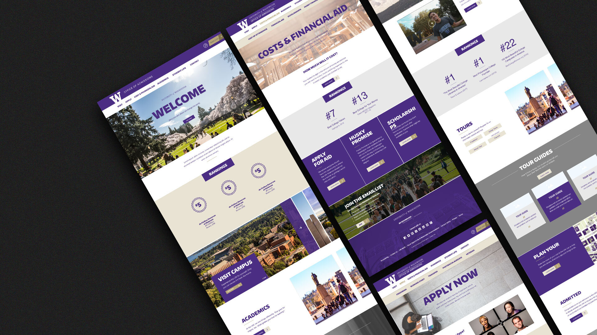
Admission’s Website Redesign
“Bradley is great at taking an idea and turning it into a beautiful design. His research into the audience, understanding their needs, wants and behaviors, allowed us to create a wonderfully dynamic website.”
Jocelyn // Senior Associate Director of Admissions
Overview
As lead designer on UW’s Creative Team, Bradley had the opportunity to redesign UW’s undergraduate website, Admit.uw.edu from the ground up.
This project had a unique set of challenges, it required a balance between two different departments and two different dev teams.
This project lead to Admitting UW’s largest freshmen class is 157 years.
This project included:
Sitemap
User Testing
Wireframing
Tools: Adobe XD, Photoshop, Illustrator
Our Findings
During the testing process, Bradley found that the biggest tangible change was the menu system. There was not a clear Hierarchy that the user needed. This change needed to be tested multiple times. Below you can see the prototype and full process
A Robust Future
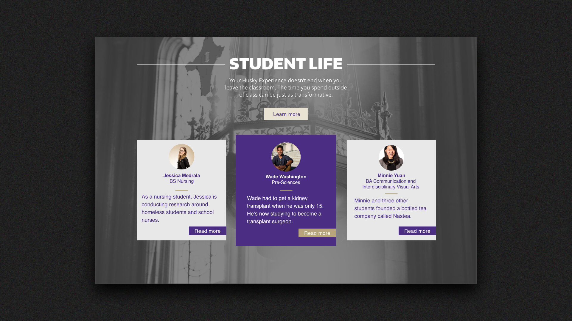
While designing and balancing the multiple teams for the Admissions Site. Bradley had to create a way to make redesigning and refreshing the site easier for any designer and developer. The series of modules Bradley created was a system that made adding different campaigns much easier and streamlined. Below you will see a series of Modules that can easily be refreshed.
“The modules helped us solve three problems at once: leverage existing styles while making it look modern and fresh, creating a streamlined backend editing experience, and creating a high impact user experience. The design was key to making it all work.”
Lauren C / Web Development Lead
Reflection
While this project was a huge overhaul, Bradley opened the door for a successful partnership today. This partnership has slowly united more departments at the University of Washington and pushed the Admission Office to have more dedicated resources.
Thank you for watching!
Below you can take a look at other projects.


